A comprehensive guide to conjoint analysis
A deeper dive into conjoint analysis and DCE with a detailed example

Introduction
Conjoint analysis is a survey-based research method for eliciting people’s preferences by asking them to choose between hypothetical alternatives represented as combinations of attributes with various levels so that the relative importance of the attributes can be quantified as weights.
These weights, referred to in conjoint analysis as part-worth utilities (or simply part-worths or utilities) are used to characterize the trade-offs that people are willing to make between the attributes and to predict how they will choose between any alternatives being modeled.
A variety of methods are available for eliciting people’s preferences typically using specialized conjoint analysis software such as 1000minds, with the data analysis usually performed automatically or, if not, via statistics packages such as R.
“Conjoint analysis” and “discrete choice experiment”
The difference between these terms is largely disciplinary rather than methodological. A discrete choice experiment (DCE) is a type of conjoint analysis – specifically, Choice-Based Conjoint (CBC) analysis. DCE and CBC involve participants choosing between alternatives defined on attributes and levels, with utilities estimated using random utility models, e.g. logit.
DCE originated in economics, health, transport and environmental research, where “discrete choice experiment” (and “discrete choice modelling”) aligns with the language of experimental design and econometrics. “Conjoint analysis” is widely referred to in market research and business applications.
The popularity of DCE terminology – particularly in academic and policy-oriented fields – was further reinforced by the 2000 Nobel Prize for Economic Sciences being jointly awarded to Daniel McFadden for coming up with DCE’s theoretical foundations.
In many applied fields, “discrete choice experiment” or “DCE” have become a kind of generic label for any structured preferences survey where people make trade-offs between multi-attribute alternatives (i.e. conjoint analysis).
Conjoint analysis (and DCE) has also been referred to, mostly historically, as choice modeling (or discrete choice modeling) and trade-off analysis.
Intended audience and what’s in this article
This article, though comprehensive in scope, has a practical emphasis and is intended for readers interested in understanding and doing conjoint analysis. If you’re new to conjoint analysis (or a little rusty), you might like to begin with our “beginner’s guide” and then return here for a deeper dive.
The first half of this article includes a short history of conjoint analysis, types of conjoint analysis and their differences, followed by specific methods and their differences.
The second half is a detailed conjoint analysis example covering things to think about when specifying attributes and levels, how to run a conjoint survey, including recruiting participants, and how to interpret the results.
Components of conjoint analysis
Conjoint analysis has three main components.
1. Attributes and levels
The attributes included in a conjoint analysis represent the key features or characteristics of the product or other object of interest (e.g. a government policy) being studied as seen from the perspective of the intended participants in the survey, e.g. consumers or citizens.
Fewer than a dozen attributes is usually sufficient for most applications though more are possible, and four to eight attributes is typical for most conjoint analysis studies.
Example:
For a conjoint survey of consumers about smartphones, the attributes might be: camera quality, size, price, screen quality, operating performance and battery life (Table 1).
As illustrated in the detailed example later in the article, some conjoint analysis software includes the option of showing participants a potentially long list of possible attributes (e.g. 20) and asking them to select the ones that are most important ones to them for their conjoint survey (whose results are still easily interpreted).
Levels
Each attribute usually has three or more levels (or categories) for describing the performance of alternatives on the attribute, though just two levels is also possible for binary attributes, e.g. “Android” and “iOS” operating systems for smartphones. There is usually no requirement for the attributes to have the same number of levels – some attributes can have three levels, others four, five or six levels, etc.
Depending on the attribute, the wording for its levels can be in quantitative or qualitative terms, including in generic qualitative terms, e.g. “good”, “very good”, etc.
Example:
- Camera quality: “ok”, “good” or “very good”
- Price: $600, $700, $800, $900 or $1000
| Camera quality | |
|---|---|
| ok | 0.0% |
| good | 15.4% |
| very good | 28.4% |
| Size | |
| small (5″) | 0.0% |
| medium (5.5″) | 8.3% |
| large (6″) | 15.3% |
| very large (6.5″+) | 21.5% |
| Price | |
| $1000 | 0.0% |
| $900 | 3.9% |
| $800 | 11.2% |
| $700 | 15.9% |
| $600 | 21.2% |
| Screen quality | |
| ok | 0.0% |
| good | 8.5% |
| very good | 11.2% |
| Operating performance | |
| ok | 0.0% |
| good | 3.1% |
| very good | 9.6% |
| Battery life | |
| ok (10 hours) | 0.0% |
| good (11–12 hours) | 2.2% |
| very good (13+ hours) | 8.0% |
2. Utilities
Utilities – also referred to as part-worths or part-worth utilities – are weights representing the relative importance of the attributes and their levels.
These values are derived from the choices expressed by survey participants and reflect how they feel about how much each attribute matters relative to the others.
Example:
If the utility (weight) for camera quality is 0.284 and for screen quality it is 0.112 (shown as 28.4% and 11.2% in Table 1), then camera quality is 2.5 times – i.e. 0.284/0.112 – as important as screen quality.
3. Alternatives
Alternatives – also known as profiles or concepts – are the underlying products or other objects of interest (e.g. a government policy) being studied in the conjoint analysis, represented as combinations of attribute levels.
Depending on the application, the number of alternatives can range from as few as a couple to a dozen, hundreds or even thousands, or potentially all possible combinations of the levels on the attributes.
Example:
Eight phone configurations (A to H) on the six attributes are shown in Table 2.
| Name | Operating performance | Camera quality | Battery life | Screen quality | Price | Size |
|---|---|---|---|---|---|---|
| Phone A | good | very good | good (11–12 hours) | ok | $800 | large (6″) |
| Phone B | very good | very good | very good (13+ hours) | very good | $1000 | large (6″) |
| Phone C | good | good | good (11–12 hours) | very good | $700 | small (5″) |
| Phone D | good | good | ok (10 hours) | good | $600 | medium (5.5″) |
| Phone E | very good | good | very good (13+ hours) | very good | $700 | large (6″) |
| Phone F | good | good | good (11–12 hours) | very good | $900 | medium (5.5″) |
| Phone G | ok | good | ok (10 hours) | good | $600 | large (6″) |
| Phone H | ok | ok | very good (13+ hours) | ok | $800 | large (6″) |
Attributes + utilities + alternatives
These three components – attributes, utilities and alternatives – form the basis of conjoint analysis.
The participants in your conjoint analysis survey, whose preferences you are seeking to elicit and codify, are also important. Depending on the application, potentially many hundreds or thousands of decision-makers or other stakeholders – e.g. consumers, employees or citizens – can participate.
As discussed later, most contemporary conjoint analysis methods involve participants being repeatedly shown “choice sets” comprising two or more hypothetical alternatives, each described by a combination of levels on the attributes, and asked to choose from them.
The simplest possible example of a choice set – with just two alternatives defined on two attributes – appears in Figure 1a. Choice sets with more alternatives and attributes are considered below.
Depending on the number of attributes and levels and the conjoint analysis method used, participants might be shown 10 to 30 choice sets each.
Analysis of their choices yields utilities for the attributes and levels, quantifying their relative importance (weights), representing people’s preferences. These scores are used to produce a ranking of the alternatives (Table 3).
| Name | Rank | Score | Attribute contribution | Operating performance | Camera quality | Battery life | Screen quality | Price | Size |
|---|---|---|---|---|---|---|---|---|---|
| Phone E | 1st | 75.4% |
|
very good | good | very good (13+ hours) | very good | $700 | large (6″) |
| Phone B | 2nd | 72.6% |
|
very good | very good | very good (13+ hours) | very good | $1000 | large (6″) |
| Phone G | 3rd | 60.5% |
|
ok | good | ok (10 hours) | good | $600 | large (6″) |
| Phone A | 4th | 60.3% |
|
good | very good | good (11–12 hours) | ok | $800 | large (6″) |
| Phone D | 5th | 56.6% |
|
good | good | ok (10 hours) | good | $600 | medium (5.5″) |
| Phone C | 6th | 47.8% |
|
good | good | good (11–12 hours) | very good | $700 | small (5″) |
| Phone F | 7th | 44.1% |
|
good | good | good (11–12 hours) | very good | $900 | medium (5.5″) |
| Phone H | 8th | 34.5% |
|
ok | ok | very good (13+ hours) | ok | $800 | large (6″) |
Two example conjoint analysis surveys
A great way to understand conjoint analysis is to experience a survey yourself from the perspective of a participant.
Please try the conjoint surveys below – created using 1000minds conjoint analysis software (that you are very welcome to try too).
The first survey is about smartphones and is the source of the illustration above and the detailed example later. The second is a more light-hearted example to help you to choose a breed of cat as a pet!
A short history of conjoint analysis
Conjoint analysis – also variously known as choice modeling, trade-off analysis and discrete choice experiments – has its theoretical foundations in psychology, mathematics, economics, statistics and market research, as surveyed here.
Choice modeling and random utility theory
Choice modeling emerged in the 1920s when US psychologist Louis Thurstone developed the “Law of Comparative Judgment” (Thurstone 1927). This idea, later termed Random Utility Theory (RUT), introduced a probabilistic perspective on preferences and choice that would become central to many later developments.
Central to RUT is the idea that when a person is choosing between alternatives, each alternative has a true but unobservable “utility” – i.e. value or amount of satisfaction – to the person, comprising a systematic and a random component respectively. Thus, the person’s choices are made probabilistically in the sense that the option with the highest expected utility is most likely to be chosen.
Trade-off and conjoint analysis
A major theoretical advance followed with US mathematicians Duncan Luce and John Tukey’s theory of conjoint measurement, which established axiomatic conditions under which preferences over multi-attribute alternatives can be represented as additive utility or value functions (Luce & Tukey 1964).
Luce and Tukey’s work established the formal basis for decomposing overall preferences into attribute-level components and linked utility theory with empirical measurement.
Originally known as “trade-off analysis” (e.g. Johnson 1976), the term “conjoint analysis” was popularized in the early 1970s by Paul Green, Vithala Rao and V “Seenu” Srinivasan. These researchers introduced practical methods for estimating part-worth utilities from ratings or rankings of full product profiles, typically using regression-based techniques (Green & Rao 1971, Green & Srinivasan 1978).
These early applications were widely adopted in marketing research and demonstrated the practical feasibility of conjoint methods. The history of conjoint analysis in marketing is traced out in Green & Srinivasan (1978, 1990) and Green, Krieger & Wind (2001).
During the 1980s, conjoint analysis expanded in response to practical challenges such as high responder burden and increasing attribute complexity. Methods such as Adaptive Conjoint Analysis (ACA) were developed to accommodate larger numbers of attributes (e.g. Green & Srinivasan 1990).
Discrete choice models and experiments
Another important methodological milestone was US econometrician Daniel McFadden’s formulation of a “discrete choice model” (DCM), specifically a multinomial logit model, which embedded Random Utility Theory within a rigorous econometric framework for analyzing people’s choices (McFadden 1974).
By showing how choice probabilities could be derived from stochastic utility functions, McFadden made RUT empirically tractable and provided the foundation for modern discrete choice modeling.
This framework, for which McFadden was jointly awarded the 2000 Nobel Prize in Economic Sciences, established the theoretical basis on which later experimental choice methods were built.
Choice-Based Conjoint (CBC) / Discrete Choice Experiments (DCE)
From the 1990s onward, Choice-Based Conjoint (CBC) – methodologically equivalent to Discrete Choice Experiments (DCE) – became increasingly prominent.
These methods involve participants choosing between alternatives and directly implement McFadden’s (1974) RUT-based framework using multinomial logit and later mixed logit and hierarchical Bayes models, enabling the analysis of preference heterogeneity and predictive choice simulation (Train 2009).
Jordan Louviere, with colleagues, helped translate discrete choice theory into practical stated-choice experiments suitable for survey-based research in marketing, transport, health and environmental economics (Louviere, Hensher & Swait 2000).
Louviere’s work also played an important role in unifying the conjoint analysis and discrete choice literatures, showing that choice-based conjoint methods are formally equivalent to discrete choice models estimated from experimental data.
Other modern conjoint analysis methods
Since the 2000s, conjoint analysis has continued to diversify. Best-Worst Scaling (BWS; Marley & Louviere 2015), also known as MaxDiff (for “maximum difference”), and Adaptive Choice-Based Conjoint (ACBC; Orme 2007) – superseding Adaptive Conjoint Analysis (ACA) – extended choice-based approaches.
Other methods designed to minimize responder burden such as PAPRIKA – an acronym for Potentially All Pairwise RanKings of all possible Alternatives – use pairwise trade-off comparisons to construct additive value functions efficiently (Hansen & Ombler 2008).
Together, these developments reflect ongoing efforts to balance cognitive burden, statistical efficiency and interpretability.
Today, conjoint analysis can be viewed as a family of related methods for decomposing preferences into utilities for attributes and levels differentiated by how preferences are elicited and utilities inferred. This diversity reflects both the theoretical foundations established over the past century and the wide range of contexts in which conjoint analysis is now applied.
Types of conjoint analysis, and their differences
The conjoint analysis methods in the short history above, which are explained in detail in the next section, can be systematically differentiated along two main dimensions:
- how participants’ preferences are elicited
- how utilities are inferred from those elicited preferences
Preference elicitation
Most contemporary conjoint analysis methods involve participants revealing their preferences by repeatedly choosing their preferred alternative from choice sets.
In contrast, early forms of conjoint analysis – nowadays referred to as “traditional” conjoint analysis – were based on less intuitive or natural methods, such as rating or scoring scales, e.g. rating one attribute relative to another on a nine-point scale ranging from “equally preferred” to “extremely preferred”.
For contemporary methods, the form their choice sets take differ in two main respects:
- Number of alternatives, or profiles, in choice sets
- Number of attributes for representing alternatives/profiles
Another key difference between methods with respect to preference elicitation is whether the choice sets shown to individual participants are selected non-adaptively or adaptively. Non-adaptive methods present the same choice sets, whereas, for adaptive methods, the choice sets are tailored (adapted) as each participant makes their choices.
Utility inference
As well as differences in preference-elicitation techniques, conjoint methods can be differentiated with respect to the inferential approach used for determining utilities – inferred at an aggregate level, representing average preferences across participants, or an individual level, capturing heterogeneity in preferences.
Inferential approaches range from model-based statistical estimation, commonly grounded in Random Utility Theory (RUT), to deterministic value-construction approaches, which infer utilities by solving systems of constraints implied by people’s choices.
In summary, conjoint analysis methods can be distinguished according to these four main characteristics:
- Number of alternatives in choice sets
- Number of attributes for representing alternatives
- Non-adaptive versus adaptive methods
- Utility inference methods
These characteristics are explained in turn below and summarized in Table 4. Understanding them is helpful for thinking about which particular conjoint analysis method, as surveyed in the next section, you want to use.
Number of alternatives in choice sets
Most conjoint analysis methods are based on choice sets with just two alternatives (profiles), such as in Figures 1, whereas other methods involve participants choosing from choice sets with three or more alternatives.
As can be seen, as well as having two alternatives, the choice set in Figure 1b has just two attributes, whereas for other methods the alternatives would be represented on more than two attributes (e.g. Figure 2 below). This issue of how many attributes are used for representing alternatives is discussed later.
Pairwise ranking
Choosing from choice sets with just two alternatives (Figures 1 and 2) corresponds to simple “pairwise ranking” and usually involves confronting trade-offs between the attributes’ levels in the two alternatives.
Compared to choosing from choice sets with more than two alternatives – e.g. imagine Figures 1 and 2 with three, four, five or more alternatives – pairwise ranking has the obvious advantage of being cognitively simpler and faster.
Pairwise ranking also has the advantage of being a natural human decision-making activity. We all make many binary choices every day: e.g. Would you like a cup of coffee or tea? Shall we walk or drive? Do you want this or that?
“The advantage of choice-based methods is that choosing, unlike scaling, is a natural human task at which we all have considerable experience, and furthermore it is observable and verifiable” (Drummond et al 2015).
Therefore, people can have greater confidence in the accuracy (validity and reliability) of their answers to pairwise-ranking questions.
To learn more about pairwise comparisons and pairwise ranking in particular, see our comprehensive guide to the pairwise ranking method.
Best-Worst Scaling (MaxDiff)
A similar but cognitively more demanding method than pairwise ranking is Best-Worst Scaling (BWS; Marley & Louviere 2015), also known as MaxDiff (for “maximum difference”).
Under MaxDiff, participants are presented with choice sets containing three to six alternatives and asked to choose the “best” and the “worst” options from each choice set. From these two choices, the implied pairwise rankings of the choice set’s alternatives (three, four, five or six) are identified and used for estimating utilities.
The process for identifying pairwise rankings can be easily illustrated via this simple example:
- Imagine you are presented with a choice set with four alternatives – A, B, C and D – and asked to identify the best and the worst You choose: best = C and worst = A
- From these two choices, five of the six possible pairwise rankings of the four alternatives are also implicitly identified: C > A, C > B, C > D, B > A, D > A (the ranking of B versus D is unknown)
Similarly, for example, for a choice set with five alternatives, the two best-worst choices are used to identify seven of the 10 possible pairwise rankings across the five alternatives.
MaxDiff is efficient in the sense that it reduces the number of decisions required to determine multiple pairwise rankings (from which utilities are derived).
On the other hand, the cognitive effort required to choose the best and worst alternatives from more than two alternatives exceeds the effort for pairwise ranking. Also, an erroneous best or worst choice can have significant negative effects for the subsequent implied rankings and hence the accuracy of the resulting utilities.
Number of attributes for representing alternatives
As well as the number of alternatives in choice sets, another differentiator of conjoint analysis methods is the number of attributes used for representing the alternatives people are asked to choose between.
In this respect, there are two types of choice set: full profile and partial profile.
Full-profile choice sets
When the full complement of attributes is used, the choice sets are referred to as full profile (Figure 2).
In extreme cases, this full complement could include, say, a dozen or more attributes – i.e. all of which would appear in (full-profile) choice sets.
Heuristics and biases
How cognitively demanding would you find choosing from full-profile choice sets like in Figure 2?
When confronted by such cognitive complexity, conjoint survey participants have been observed to engage in heuristics, or mental shortcuts, which are likely to introduce biases.
Two potentially important biases are documented in the literature:
- “the prominence effect” (Tversky, Sattath & Slovic 1988; Fischer, Carmon, Ariely & Zauberman 1998)
- “attribute non-attendance” (Hensher, Rose & Greene 2005)
Prominence-effect bias arises when, in response to being asked to choose between full-profile alternatives, the person chooses the one with the higher level on the attribute that is most important, or “prominent”, to them.
For example, for someone who is price-sensitive, the “prominent” attribute in Figure 2 is likely to be price. For a keen photographer it would be camera quality; for a short-sighted person it would be size; etc.
Attribute-non-attendance bias is when the person ignores at least one of the attributes in the full-profile choice set – not because they don’t care about these “non-attended attributes” but because they don’t understand them or how they are expressed, or they are too difficult to think about, especially when other attributes are more important or easier to think about.
The prominence effect and attribute non-attendance – resulting in people unduly fixating on some attributes and ignoring others – undermines the validity of their elicited preferences, leading to biased conjoint survey results.
Partial-profile choice sets
To reduce cognitive complexity, some conjoint analysis methods are based on partial-profile choice sets (instead of full-profile choice sets).
Partial-profile choice sets are defined on a subset of the attributes in the survey, where the levels on the excluded attributes can be explicitly or implicitly treated as the same for the alternatives in the choice set: i.e. “all else being equal”.
Partial-profile choice sets have the obvious advantage of being cognitively easier and quicker for people to choose from than full-profile ones – because partial-profile choice sets involve relatively fewer attributes.
The simplest possible partial-profile choice set – the easiest to choose from – has just two attributes (Figure 3), where each choice set presented to participants has a different pair of attributes drawn from the survey’s complement of attributes.
It is perhaps tempting to criticize partial profiles as being overly simplistic representations of real-world choices. However, conjoint analysis based on partial-profile choice sets has been conclusively shown to reflect participants’ true preferences more accurately than conjoint analysis based on full profiles (Chrzan 2010; Meyerhoff & Oehlmann 2023).
Non-adaptive versus adaptive conjoint analysis methods
Another key difference between conjoint analysis methods is how the particular choice sets presented to survey participants are selected: non-adaptively or adaptively.
Non-adaptive methods
Non-adaptive methods involve the same group of choice sets being presented to all participants in the survey. For example, every participant might be asked to choose from the same 10 or more choice sets.
Because the number of possible choice sets increases exponentially – potentially in the thousands or millions – with the number of attributes and levels in the conjoint analysis, it is usually impossible to present more than a very small fraction of them. As a result, an important technical issue when setting up a non-adaptive conjoint survey is selecting in advance which choice sets to include.
This process, known as “fractional factorial design” (in contrast to “full factorial design”), involves carefully selecting, or “designing”, a small but informative subset of all possible choice sets. The objective is to keep the survey short and manageable for participants, while still including enough well-chosen choice sets to allow the relative importance of each attribute to be estimated accurately.
In addition, survey participants are usually divided into sub-samples and presented with their own common block of choice sets. These blocks across sub-samples are intended to be complementary by efficiently spanning the entire space of possible choice sets – known as efficient fractional factorial design.
Coming up with an efficient fractional factorial design usually requires specialized methods and software – and considerable care – which adds another layer of complexity to running a conjoint survey based on non-adaptive methods.
Adaptive methods
In contrast to non-adaptive methods, adaptive methods tailor the choice sets shown to each participant as the survey progresses, greatly reducing or eliminating the need for extensive up-front design. Two prominent adaptive methods are Adaptive Choice-Based Conjoint and the PAPRIKA method, as explained below.
The objective of Adaptive Choice-Based Conjoint (ACBC) is to efficiently estimate additive utility functions while minimizing responder burden, particularly in studies with many attributes and levels.
ACBC begins with a series of preliminary tasks to elicit relatively coarse preference information. These tasks typically involve asking each participant to specify an ideal or preferred combination of attribute levels (known as “build your own”) and to indicate attribute levels that are unacceptable to them.
For each participant, this information is used to identify which attributes and levels are most relevant and to eliminate large numbers of alternatives that are clearly unappealing. Based on this initial screening, the person is then shown a sequence of choice sets designed to focus on trade-offs among the remaining alternatives that are most relevant to them.
As the survey progresses, the selection of choice sets is continually updated using the person’s earlier responses, so that subsequent questions are increasingly targeted toward distinguishing between plausible alternatives and refining estimates of the participant’s preferences.
From the participant’s choices across these tailored choice sets, their utilities are inferred using statistical-estimation methods, most commonly hierarchical Bayes methods, as discussed in the next section.
Like ACBC, the PAPRIKA method – an acronym for Potentially All Pairwise RanKings of all possible Alternatives – also has the objective of minimizing responder burden so that the method is user-friendly (Hansen & Ombler 2008).
This method is based on the principle that a complete ranking of all possible alternatives – i.e. all possible combinations of the levels on the criteria – is defined when all pairwise rankings of the alternatives are known (and consistent).
For each participant, PAPRIKA determines the most efficient sequence of choice sets (e.g. Figure 4) to present, one-by-one in real time, so that the number of choices (i.e. pairwise rankings) needed to determine all pairwise rankings is minimized.
Each time the person makes a choice, PAPRIKA selects their next choice set based on all their earlier pairwise rankings, and this process repeats until all such pairwise rankings have been identified, explicitly or implicitly. This process is illustrated in the two example conjoint surveys above.
PAPRIKA’s adaptivity is based on a very large scale on the mathematical and logical properties of additive utility models, such as transitivity, as illustrated in this simple example:
Suppose you are asked to rank alternative X relative to Y, and you choose X.
Utility inference methods
Based on people’s choices from the choice sets, utilities for the attributes in the form of weights, representing the relative importance of the attributes, are inferred.
Modern methods for calculating utilities are mostly based on statistical estimation, which models choice behavior probabilistically, or linear programming, which infers utilities by solving systems of constraints implied by people’s choices.
Statistical estimation
Methods based on statistical estimation model the probability of each alternative being chosen by survey participants as a function of its attributes. The most common models used for this purpose are logit choice models, such as multinomial or conditional logit.
Utilities are calculated by estimating the relationship between the alternatives’ attributes and the probability that an individual chooses each alternative. Each attribute level is a variable in the statistical model, with the regression coefficients (βs) quantifying each attribute’s contribution to the overall utility of an alternative.
A logistic function then converts these utilities into choice probabilities, ensuring they lie between 0 and 1, which allows the effect of changes in attributes on the likelihood of selection to be interpreted.
These logit choice models are most commonly estimated nowadays using hierarchical Bayes (HB) methods. HB estimation allows utilities to be inferred at the individual level while simultaneously pooling information across participants. This pooling introduces what is known as “shrinkage”, meaning that each person’s estimated utilities are gently pulled toward the average pattern observed in the sample.
Shrinkage helps stabilize individual-level estimates when each person provides only a limited amount of data (e.g. choices), reducing the influence of random or inconsistent responses. The less data there is for an individual, the stronger this pull toward the group average tends to be; as more and higher-quality individual data is collected, the estimates increasingly rely on that person’s own responses.
Other statistical approaches, such as maximum likelihood estimation, may also be used, typically to estimate population-level or segment-level preferences rather than individual-level utilities.
The finer details of the above-mentioned methods are technically complicated and beyond the scope of this article. For interested readers (with the requisite technical skills themselves!), many other resources are available elsewhere, such as Train (2009).
For most people undertaking a conjoint survey, understanding these finer details is usually unnecessary because they are taken care of by specialized conjoint analysis software or skillful statisticians supporting the analysis.
Linear programming
Another approach to inferring utilities is based on optimization techniques, specifically linear programming. A prominent example is the PAPRIKA method discussed in the previous section about adaptive methods, implemented in 1000minds software.
PAPRIKA operationalizes each participant’s pairwise rankings across their choice sets as a system of linear inequalities for strict preference (“This one” in the figures above) and equalities for indifference (“They are equal” above), consistent with an underlying additive utility model common to conjoint analysis.
The adaptive nature of PAPRIKA discussed earlier, based on the mathematical and logical properties of additive utility models, ensures each participant’s inequalities and equalities are logically consistent and the number in each system is minimized.
From each participant’s system, their individual utilities are determined using linear programming by solving for the weights satisfying their pairwise rankings (and implied ones), normalized as utilities for each attribute level. Technical details are available in Hansen and Ombler (2008).
Because PAPRIKA derives each person’s utilities entirely from their own pairwise rankings – independently of everyone else in the conjoint survey – it does not rely on average patterns in the sample, in contrast to hierarchical Bayes estimation discussed in the previous section. There is therefore no “shrinkage” (explained earlier): instead, each person’s utilities are determined solely from their own data.
This contrast highlights an important difference between conjoint analysis methods with respect to the extent to which individual-level utilities accurately reflect a person’s own responses alone versus being stabilized by shrinkage toward group-level patterns.
Summary of distinguishing characteristics
| Characteristic | Why it matters | Best practice – and why |
|---|---|---|
| Number of alternatives in choice sets | Cognitive difficulty for participants to make choices | Two alternatives – cognitively easiest for participants |
| Number of attributes for representing alternatives | Cognitive difficulty for participants to make choices | Two attributes – cognitively easiest for participants |
| Non-adaptive versus adaptive | Design issues when setting up conjoint analysis or not | Adaptive methods – no design issues |
| Methods for calculating utilities | Validity and reliability of survey results | All methods have pros and cons |
Conjoint analysis methods
Consistent with the discussion of types of conjoint analysis and their differences above, this section presents a survey of the main conjoint analysis methods, as summarized in Table 5 below.
Preference elicitation Preferences are elicited via ratings or rankings of alternatives, where each alternative is defined on all attributes (full profiles). Choice tasks are typically non-adaptive, with all participants evaluating the same set of profiles. Utility inference Utilities are most commonly inferred using regression-based methods, such as ordinary least squares or monotonic regression. Estimation is typically conducted at the aggregate level. Individual-level utilities are possible but unstable unless sufficient data per participant is available. Why it’s popular Traditional conjoint analysis remains in use due to its simplicity, transparency, and long-standing acceptance in applied research. Strengths Limitations Further reading Green & Rao (1971), Green & Srinivasan (1978) Preference elicitation Participants repeatedly choose their preferred option from a choice set of full-profile alternatives, often including a “none” or “status quo” option. Choice sets are typically non-adaptive, although designs may be blocked or optimized. Utility inference Utilities are inferred using random utility models based on Random Utility Theory (RUT), most commonly multinomial logit, mixed logit and hierarchical Bayes (HB) estimation. Estimation may be conducted at the aggregate level (e.g. aggregate logit) or at the individual level, particularly when HB methods are used. Why it’s popular CBC/DCE aligns closely with economic theory and observed choice behavior, making it a common method in economics, health, transport and environmental research. Strengths Limitations Further reading Louviere, Hensher & Swait (2000), McFadden (1974) Preference elicitation ACBC uses preliminary tasks, such as specifying a preferred combination of attribute levels (“build-your-own”) and screening out of unacceptable options, followed by tailored choice sets. Early stages often involve partial profiles, with later stages presenting more complete profiles. Utility inference Utilities are inferred using random utility models, typically estimated at the individual level using hierarchical Bayes methods. Why it’s popular ACBC extends CBC to complex products and configuration problems with more attributes and levels, where standard choice sets would be inefficient or overly burdensome. Strengths Limitations Further reading Orme (2007) Preference elicitation Participants identify the most and least preferred alternatives from choice sets containing three to six alternatives. Alternatives are usually partial profiles and choice sets are non-adaptive. Utility inference Utilities are inferred using logit-based random utility models or simpler counting approaches. Estimation may be performed at either the aggregate or individual level, depending on the modeling approach and data availability. Why it’s popular MaxDiff is efficient in the sense that it reduces the number of decisions required to determine multiple pairwise rankings (from which utilities are derived). Strengths Limitations Further reading Marley & Louviere (2005), Louviere, Flynn & Marley (2015) Preference elicitation PAPRIKA – an acronym for Potentially All Pairwise RanKings of all possible Alternatives – elicits preferences using pairwise trade-off comparisons between partial-profile alternatives defined on only two attributes at a time, though more attributes are also possible. Each participant’s choice sets are adaptive, with new ones based on earlier choices. Utility inference Each participant’s utilities are inferred directly from the implied preference constraints revealed by their choices, rather than statistical estimation. Why it’s popular PAPRIKA identifies a stable, individual-level value function for each participant, and is well suited to applications where transparency, easy interpretability and low responder burden are important. Strengths Limitations Further reading Hansen & Ombler (2008); PAPRIKA method
* Abbreviations: OLS = ordinary least squares, RUT = Random Utility Theory, MNL = multinomial logit, HB = hierarchical Bayes, PAPRIKA = Potentially All Pairwise RanKings of all possible Alternatives Your choice of conjoint analysis method is likely to be influenced by these considerations: A very important practical consideration is how are you planning to implement your preferred method, in particular eliciting participants’ preferences via a conjoint survey and inferring utilities from those elicited preferences? Your two options are: If you are going to use specialized conjoint analysis software, what method does it use? Most software is based around a particular method or group of related methods. Not all methods are available in all platforms. If you are going to use a DIY approach, do you have – or have access to – the requisite technical skills and knowledge (and time) to create and run the survey and estimate the utilities yourself? Most people opt for using specialized conjoint analysis software.Rating- and ranking-based conjoint analysis (traditional conjoint)
Choice-Based Conjoint (CBC) / Discrete Choice Experiments (DCE)
Adaptive Choice-Based Conjoint (ACBC)
Best-Worst Scaling (MaxDiff)
PAPRIKA method
Method
Response format
Profile structure
Alternatives in choice sets
Adaptive?
Utility inference methods*
Accuracy of individual‑level utilities
Traditional conjoint
Ratings or rankings
Full
Often many (design-dependent)
No
Regression-based (OLS, monotonic regression); rank-ordered logit
Low to moderate: depends on number of responses per person
Choice-Based Conjoint (CBC / DCE)
Discrete choices
Full
2–5
(+ opt-out)Typically no
Stochastic RUT models (MNL, mixed logit)
Moderate: improved by HB, but shrinkage# remains
Adaptive Choice-Based Conjoint (ACBC)
Adaptive discrete choices
Partial → full
2–4
Yes
Stochastic RUT models (HB logit)
Moderate: improved by HB, but shrinkage remains
MaxDiff
Best-worst choices
Partial or full
3–6
Usually no
Logit-based RUT models or counting
Moderate to high: improved by adaptivity, but shrinkage remains
PAPRIKA
Pairwise trade-off comparisons
Partial → full (optional)
2
Yes
Deterministic construction of additive value functions
High: based entirely on each person’s trade-offs, no shrinkage
# “Shrinkage” means that each person’s estimated utilities are pulled toward the average pattern in the sample (discussed earlier).
Which method should you use?
A conjoint analysis example
This second half of the article comprises a discrete choice example about smartphones – an application most people can easily relate to.
Three main topics are covered:
- Things to think about when specifying a conjoint analysis survey’s attributes and levels
- How to run a conjoint survey, including recruiting participants
- How to interpret a survey’s results
The smartphone example is illustrated using results generated using the PAPRIKA method, implemented by 1000minds conjoint analysis software – which, as discussed earlier (e.g. Table 5), is an adaptive, choice-based approach involving pairwise trade-off comparisons.
Despite being adaptive and choice-based, strictly speaking, PAPRIKA is not classifiable methodologically as Adaptive Choice-Based Conjoint (ACBC), Choice-Based Conjoint (CBC) or a Discrete Choice Experiment (DCE) – because it does not use random-utility models for estimating utilities (instead, PAPRIKA infers participants’ utilities directly from their choices).
Nonetheless, PAPRIKA produces functionally equivalent results – including utilities at the individual and aggregate participant levels, alternative rankings and total utility scores – that are used in the same way as results from ACBC/CBC/DCE and other methods. Therefore, the results and explanations for this section’s example are relevant in general.
Compared to other methods, PAPRIKA offers lower responder burden, highly accurate individual-level utilities and transparent, easily interpretable results.
For these reasons, 1000minds is a fast and efficient way to conduct preferences research that is “ACBC/CBC/DCE-like” while avoiding the technical and design demands associated with these other approaches.
Specifying attributes and their levels
After having defined the research question you want to address – such as designing a product (e.g. a smartphone) or shaping a public policy – an important next step is specifying your conjoint survey’s attributes and their levels.
Sometimes you will already have a good idea of the attributes and levels you want to use – e.g. because you’ve done this kind of research before – but other times you’ll be starting from scratch.
Here are possible approaches for coming up with potential attributes and levels, depending on your application:
- Literature review: Review existing conjoint analysis or DCE studies, or market research on similar products and extract commonly used attributes and levels as a starting point.
- Expert consultation: Run interviews or workshops with industry experts, engineers or marketers (etc) with the expertise and experience to identify relevant attributes.
- Focus groups or consumer interviews: Conduct qualitative discussions with potential users and explore what features matter most to them.
- Observation or ethnographic research: Observe how people use or choose between products in real-world settings, thereby identifying attributes that drive choices naturally.
- Product decomposition: Break down existing products (e.g. smartphones) into measurable components and analyze features that vary meaningfully between brands or models.
- Market or competitor analysis: Compare specifications and pricing of competing products to infer relevant attributes and realistic level ranges.
- Brainstorming and Delphi methods: Use structured group processes – e.g. Delphi panels – to generate and refine candidate attributes and reach consensus among stakeholders. (You might like to check out our guide to the Delphi method.
- Pilot-testing and attribute refinement: Run small-scale pilot surveys or rating tasks to test participants’ understanding of the attributes and levels and their realism.
- Text and data mining: Analyze online reviews, social media posts or customer feedback to identify frequently mentioned product features or pain points.
- “Noise auditing”: Have participants rank real or imaginary alternatives to reveal judgment variability (“noise”) and stimulate discussion of attributes for choosing between them.
If you are using 1000minds conjoint analysis software, an AI Assistant is available to suggest attributes and levels – and alternatives too, if desired – to get you up and running quickly, e.g. to create a proof-of-concept or “starter” model to build on.
Desirable properties of attributes and levels
When specifying attributes and levels for conjoint analysis surveys (e.g. about smartphones) it’s essential they are well-defined and relevant. The quality of your attributes/levels directly affects the validity and reliability of your survey results.
Here are eight desirable properties of attributes and levels. You might like to use them as a checklist as you go about specifying your own ones.
1. Relevance and Importance
Each attribute should be salient and meaningful to survey participants – something they genuinely care about when making real-world choices. Including unimportant or trivial attributes adds noise, unnecessary complexity and distracts from what truly drives preferences.
2. Independence (avoiding double-counting)
Attributes should be conceptually and empirically distinct from one another. Overlapping or redundant attributes – such as both “battery life” and “battery capacity” for smartphones – can lead to double-counting, where similar concepts are measured twice and their utilities become confounded.
3. Comprehensibility and Realism
Attributes and their levels should be easy for participants to understand and reflective of realistic trade-offs. People should be able to meaningfully evaluate each combination of attribute levels. Avoid overly technical jargon or attributes that produce incomprehensible or unimaginable profiles.
4. Manageable number of attributes
Specifying too many attributes can overwhelm participants and cause fatigue or inconsistent answers. Fewer than a dozen attributes is usually appropriate, and four to eight is typical, depending on complexity. Fewer, well-chosen attributes are generally preferable to many weak ones.
5. Controllability and Policy relevance
Each attribute should correspond to something that can be influenced, changed or designed – by a business, policymaker or decision-maker. Including attributes that can’t be controlled, such as “brand loyalty” or “friend recommendations”, reduces a survey’s practical value.
6. Balanced level ranges
The levels of each attribute should cover the full realistic range of variation: not too narrow (making it hard to detect preferences) and not too wide (making scenarios unrealistic). For example, phone “battery life” levels could range from 8 to 20 hours, i.e. reflecting plausible differences.
7. Mutual exclusivity and Exhaustiveness
Attributes should be mutually exclusive (not overlapping in meaning) and collectively exhaustive (covering all important aspects of the decision). Satisfying these two properties helps ensure the model captures all relevant dimensions of preference without redundancy or gaps.
8. Neutrality and lack of bias
Descriptions for attributes’ levels should be value-neutral so that they do not lead participants toward a particular choice. For example, “budget-friendly price” is likely to introduce bias, whereas, in contrast, “price: $100” is neutral and measurable.
An illustrative set of six attributes and their levels for a conjoint survey about smartphones appear in Table 6.
| Camera quality |
|---|
| ok |
| good |
| very good |
| Size |
| small (5″) |
| medium (5.5″) |
| large (6″) |
| very large (6.5+") |
| Price |
| $1000 |
| $900 |
| $800 |
| $700 |
| $600 |
| Screen quality |
| ok |
| good |
| very good |
| Operating performance |
| ok |
| good |
| very good |
| Battery life |
| ok (10 hours) |
| good (11–12 hours) |
| very good (13+ hours) |
Optional attributes
In most conjoint analysis surveys, usually for reasons of administrative convenience, participants evaluate the same set of attributes, such as the six in Table 6 above.
Alternatively, the 1000minds software used for illustrating the example allows you to set up the survey so that each participant gets shown up to 30 possible attributes and asked to select the most important ones to them for their conjoint survey (Figure 4).
The survey administrator can also specify some attributes as mandatory (instead of optional) in the survey – e.g. price – if desired.
This “optional attributes” approach eliminates the pressure when you are setting up a conjoint survey of having to specify a definitive and potentially restrictively small set of attributes capable of universal relevance to all participants, while generating easily interpretable survey results.

Self-explication
For many conjoint analysis methods, including PAPRIKA, the ranking of the levels for each attribute needs to be defined before each participant sees a choice set – so that the choice sets involve trade-offs between the attributes.
In practice, most attributes have levels with an inherent and incontrovertible, or automatic, ranking. For example, all else being equal, a low-priced phone is always more desirable than an expensive one; a great camera is always preferable to a basic one (again, all else being equal).
On the other hand, the levels for some attributes do not have an inherent and incontrovertible ranking. Instead, their ranking depends on each individual’s idiosyncratic preferences.
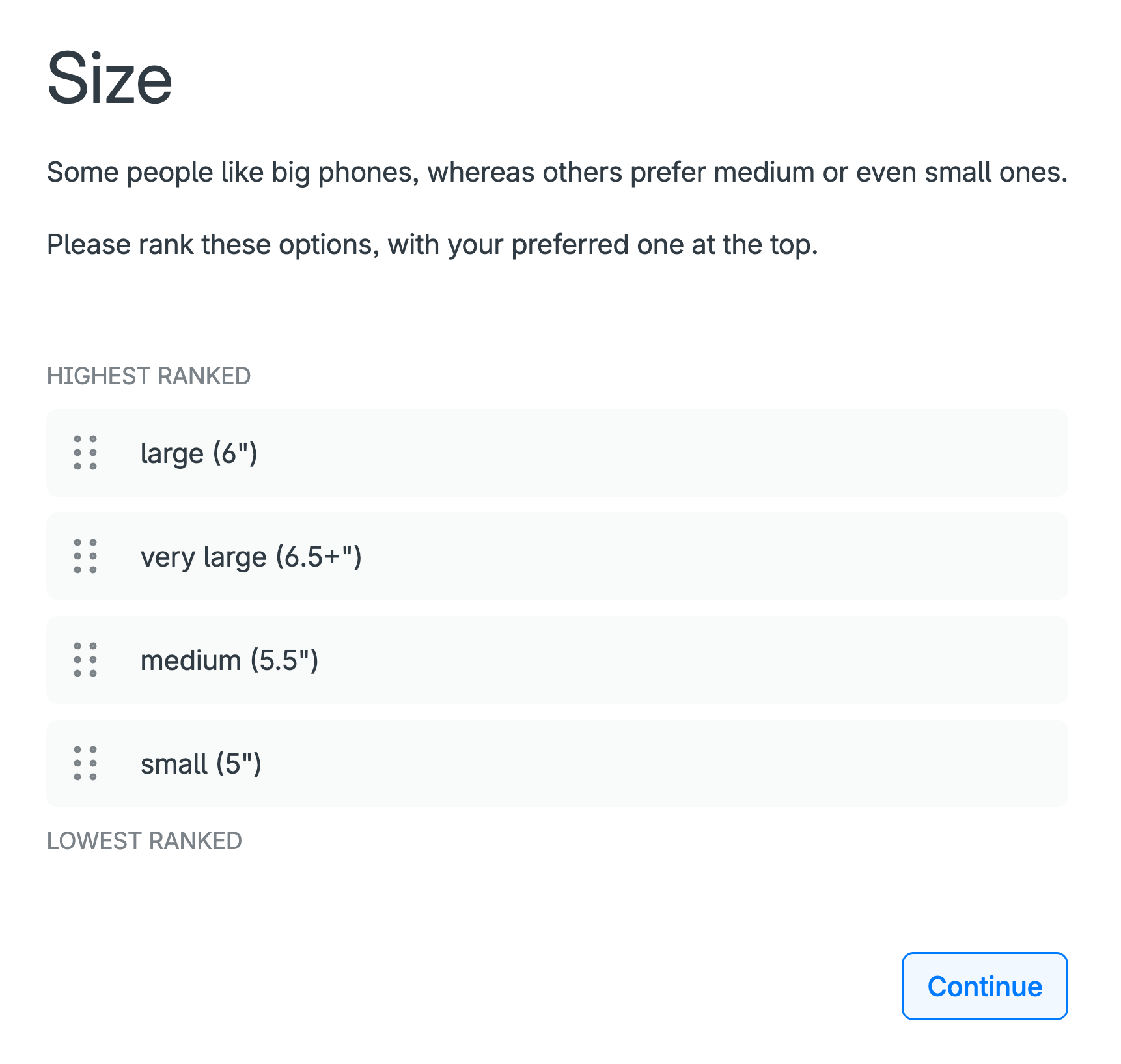
An example is phone size: some people prefer large phones, whereas others prefer medium or small phones, e.g. because they fit better in people’s pockets or are easier for people with small hands.
For such attributes, the ranking of their levels needs to be “self-explicated”, or explicitly stated, by the participant before they are presented with their choice sets (Figure 5).
If you have not already done so, you can experience this self-explication exercise in the smartphone DCE.
Running a survey
Choosing the right participants is critical to the success of any conjoint analysis study. The quality and relevance of your results depend on who completes your conjoint survey.
Who should take your conjoint survey?
The ideal participants are people who represent the population you are studying – such as, depending on your application, your target customers, patients, citizens, employees or stakeholders.
In general, you want people who will understand the choice set scenarios you’re testing and whose preferences will inform meaningful decision-making based on your survey’s results.
For example:
- A product designer testing pricing options should survey actual or potential customers.
- A health economist evaluating treatment trade-offs should solicit responses from patients or clinicians.
- A government agency seeking input on infrastructure plans should involve members of the public.
How many participants do you need?
There’s no one-size-fits-all answer. A rule of thumb for most conjoint studies is to aim for at least 100 people to get statistically robust results – more participants if you are segmenting your data by sub-groups (e.g. age, gender, region). Checking with a statistician and/or an online statistical power calculator is likely to be worthwhile.
As well as the sample size, how the sample is selected is also critical to the validity of your results – specifically, random versus non-random sampling.
- Random sampling means that each individual in the population of interest has the same chance of being selected for the survey, which helps ensure the sample reflects the true diversity of the population (age, gender, opinions, etc).
- Non-random sampling, e.g. “convenience” sampling – such as surveying people in your networks, or “snowball” sampling, where participants share the survey in their networks, can over-represent some groups and under-represent others, introducing “selection bias”.
The power of conjoint analysis software like 1000minds is that there are major economies of scale. Having created a 1000minds conjoint survey, whether you send it to 200 or 400 people (or 5000) has little effect on the overall cost and effort involved – contingent on how you go about recruiting your participants.
How to recruit participants
There is a variety of ways to reach participants for your conjoint analysis survey. Depending on your application, here are some ways you can get your survey in front of the right people.
Email invitations to your own list
This approach reaches a known audience directly, and is ideal when surveying existing users, stakeholders or internal teams, e.g. customers, employees.
If you know where people hang out
If you know what your audience looks at – e.g. a Facebook page, Reddit, your customer portal, a train station or a milk carton – you can share a link to your survey there and ask people to click it or enter it into their device.
Social media or website links
Share your survey link through your organization’s social channels or embed it on a website to reach a wider or more organic audience.
In-person recruitment
Ideal for research involving specialized groups, such as clinicians, patients or community stakeholders, particularly in the public sector or health care settings.
Advertising
You can use Facebook advertising, Google AdWords, etc to create targeted advertisements for your survey. This can be useful if your survey is interesting enough, or if your advertisement offers a reward, e.g. to be entered into a draw for a grocery voucher or an iPad.
Snowball sampling
At the end of your survey ask participants to share it with others on social media or by email (to create a snowball effect with your survey rolling along gathering momentum).
Convenience sampling
If you do not care who does your survey – e.g. because all you want is feedback for testing purposes – you can ask anyone who is easy to contact via your personal and professional networks like friends, family and colleagues.
Survey panels and online recruitment platforms
You can purchase a sample of participants from a panel provider or market research company offering access to large pools of pre-enrolled participants.
This approach allows you to target participant panels by their characteristics such as age, gender, location, occupation, interests and more, and is especially useful if you need to access specific groups or regions.
Some providers offer self-service dashboards so you can easily control the targeting, pricing, how much you spend, and reporting process.
Here are four global panel providers:
- Cint: “access to millions of respondents across 130 countries from over 800 integrated suppliers”
- Dynata: “a global reach of nearly 70 million consumers and business professionals”
- PureSpectrum: “provides researchers instant access to multi-source respondents from high-quality global panels”
- Cloud Research: “provide academic and market researchers immediate access to millions of diverse, high-quality respondents around the world”
Data quality control
Especially if you are surveying members of the general public or people recruited via panel providers (who are usually rewarded in some way), you should be mindful of the quality of their responses. Maintaining high data-quality standards is important so you can have confidence in the validity and reliability of your results.
Ideally, the conjoint survey software you are using will make it easy to identify and exclude low-quality responses that are indicative of participants’ failure to understand or sincerely engage with the survey.
1000minds, for example, includes customizable “exclusion rules” for identifying and excluding participants who when choosing from their choice sets exhibit these potentially “telltale” behaviors:
- They contradict themselves when at the end of their survey, unbeknown to them, they are re-presented with two or three choice sets they chose from earlier, i.e. a consistency check
- They make their choices unreasonably quickly – known as “speeders”
- They choose the same option for every question, suggestive of just clicking through
It’s also good practice to ask participants at the end of their survey about the extent to which they felt they understood the choice-set questions they were asked.
In addition, each participant can be shown their own survey results with respect to their ranking of the attributes and, as a face validity test, asked if they think it matches their intuition, and if it is different, in what way.
Interpreting conjoint analysis results
Most conjoint analysis surveys include 100s or 1000s of participants. However, for simplicity, the smartphone example used here for illustrating how to interpret a survey’s results has just five participants: Bao, Neha, Peter, Sajid and Susan.
Also for simplicity, bearing in mind the possibility of “optional attributes” and “self-explication” (both discussed earlier, Figures 5 and 6), let’s assume that these five participants chose the same six attributes as in Table 6 above; and, for the size attribute, they “self-explicated” the ranking of its levels as reported in the table.
Utilities, and their interpretation
The utilities (also known as part-worth utilities or simply part-worths) for Bao, Neha, Peter, Sajid and Susan are reported in Table 7. Also reported are the group’s mean utilities and standard deviations (SD), as calculated in the usual way.
In short, these utilities codify how Bao, Neha, Peter, Sajid and Susan – as individuals and on average – feel about the relative importance of the six smartphone attributes.
For each participant and the group overall (means), each utility value captures two combined effects with respect to the relevant attribute and level:
-
the relative importance (weight) of the attribute:
- represented by the bolded values in Table 7
- these values sum to 100% (1), and see the donut chart in Figure 6
-
the level’s “degree of performance” on the attribute:
- the lowest level = minimum (“worst”) possible performance: always worth 0%
- the highest level = maximum (“best”) possible performance: the attribute’s overall weight (as above)
- levels between these two extremes = some fractional value of the attribute’s overall weight
A shortcut to appreciating these two combined effects is available by studying Table 8. This table shows an equivalent representation of Table 7’s mean utilities decomposed into “normalized weights and scores” respectively, corresponding to the two main bullet points above. This equivalence can be easily confirmed by multiplying for each level the associated weights and scores to get the utilities.
| Summary statistics (n = 5) |
Participants | ||||||
|---|---|---|---|---|---|---|---|
| Mean | SD | Bao | Neha | Peter | Sajid | Susan | |
| Camera quality | |||||||
| ok | 0.0% | 0.0% | 0.0% | 0.0% | 0.0% | 0.0% | 0.0% |
| good | 15.4% | 8.7% | 4.5% | 7.6% | 20.1% | 21.7% | 23.1% |
| very good | 28.4% | 14.4% | 10.7% | 20.2% | 43.1% | 43.4% | 24.6% |
| Size | |||||||
| small (5″) | 0.0% | 0.0% | 0.0% | 0.0% | 0.0% | 0.0% | 0.0% |
| medium (5.5″) | 8.3% | 7.0% | 10.7% | 0.8% | 18.6% | 8.5% | 3.0% |
| large (6″) | 15.3% | 8.3% | 27.7% | 8.4% | 19.6% | 12.2% | 8.7% |
| very large (6.5″+) | 21.5% | 8.3% | 32.8% | 21.4% | 22.5% | 21.4% | 9.5% |
| Price | |||||||
| $1000 | 0.0% | 0.0% | 0.0% | 0.0% | 0.0% | 0.0% | 0.0% |
| $900 | 3.9% | 2.8% | 1.1% | 7.3% | 4.4% | 1.0% | 5.7% |
| $800 | 11.2% | 2.8% | 7.9% | 10.3% | 10.3% | 11.9% | 15.5% |
| $700 | 15.9% | 5.0% | 13.6% | 12.2% | 14.7% | 14.2% | 24.6% |
| $600 | 21.2% | 7.6% | 17.5% | 19.8% | 19.1% | 15.3% | 34.5% |
| Screen quality | |||||||
| ok | 0.0% | 0.0% | 0.0% | 0.0% | 0.0% | 0.0% | 0.0% |
| good | 8.5% | 8.1% | 2.8% | 9.5% | 2.0% | 6.1% | 22.0% |
| very good | 11.2% | 6.8% | 8.5% | 9.9% | 5.9% | 8.8% | 23.1% |
| Operating performance | |||||||
| ok | 0.0% | 0.0% | 0.0% | 0.0% | 0.0% | 0.0% | 0.0% |
| good | 3.1% | 1.1% | 4.0% | 1.5% | 2.5% | 4.1% | 3.4% |
| very good | 9.6% | 9.5% | 26.6% | 6.9% | 3.9% | 5.4% | 5.3% |
| Battery life | |||||||
| ok (10 hours) | 0.0% | 0.0% | 0.0% | 0.0% | 0.0% | 0.0% | 0.0% |
| good (11–12 hours) | 2.2% | 1.7% | 1.1% | 1.1% | 1.5% | 5.1% | 2.3% |
| very good (13+ hours) | 8.0% | 7.8% | 4.0% | 21.8% | 5.4% | 5.8% | 3.0% |

| Weight (sum = 1) | Score (0–100) | Utility | |||
|---|---|---|---|---|---|
| Camera quality | |||||
| ok | × | 0.0 | = | 0.0% | |
| good | 0.284 | × | 54.2 | = | 15.4% |
| very good | × | 100.0 | = | 28.4% | |
| Size | |||||
| small (5″) | × | 0.0 | = | 0.0% | |
| medium (5.5″) | 0.215 | × | 38.7 | = | 8.3% |
| large (6″) | × | 71.2 | = | 15.3% | |
| very large (6.5″+) | × | 100.0 | = | 21.5% | |
| Price | |||||
| $1000 | × | 0.0 | = | 0.0% | |
| $900 | × | 18.4 | = | 3.9% | |
| $800 | 0.212 | × | 52.6 | = | 11.2% |
| $700 | × | 74.7 | = | 15.9% | |
| $600 | × | 100.0 | = | 21.2% | |
| Screen quality | |||||
| ok | × | 0.0 | = | 0.0% | |
| good | 0.112 | × | 75.4 | = | 8.5% |
| very good | × | 100.0 | = | 11.2% | |
| Operating performance | |||||
| ok | × | 0.0 | = | 0.0% | |
| good | 0.096 | × | 32.1 | = | 3.1% |
| very good | × | 100.0 | = | 9.6% | |
| Battery life | |||||
| ok (10 hours) | × | 0.0 | = | 0.0% | |
| good (11–12 hours) | 0.080 | × | 27.8 | = | 2.2% |
| very good (13+ hours) | × | 100.0 | = | 8.0% | |
What matters most?
As revealed by the weights in Tables 6 and 7 and Figure 6, on average, the most important attribute is camera quality (28.4%), followed by size (21.5%), then price (21.2%), screen quality (11.2%) and operating performance (9.6%), and the least important is battery life (8%).
It can also be said that “camera quality’s importance is 28.4%” and “battery life’s importance is 8%” (and so on for the other attributes).
An attribute’s importance – its weight or utility – depends on how its levels are defined: the broader and more salient the levels, the more important the attribute will be to people.
For any of the non-price attributes, they would be revealed as more important – having higher utility – if their highest level were specified as “spectacular” instead of just “very good”. For example, a “spectacular” camera is more desirable than a “very good” one and so if the former description were used the camera-quality attribute would end up with a higher weight (utility).
Top-ranked alternative scores 100%
As will be explained in detail later (don’t worry if this point is unclear now), for each participant and on average, the theoretically top-ranked (e.g. “best”) alternative – i.e. the one with the highest levels on all attributes – has a total utility of 100%, for example here from the means: 28.4 + 21.5 + 21.2 + 11.2 + 9.6 + 8 = 100 (due to rounding to one decimal place, these reported weights sum to 99.9).
This point that the top ranking alternative scores 100% means that out of a maximum total utility (“score”) of 100%, on average, 28.4% is going on camera quality, 21.5% on size, and so on for the other attributes, down to 8% for battery life (Tables 6 and 7, Figure 6).
At the other extreme, the lowest-ranking (“worst”) alternative, with the lowest levels on all attributes, has a total utility of 0%, i.e. the sum of six zeros.
Thus, each of the possible combinations of the levels on the attributes, corresponding to all possible configurations of the alternatives (phones) – i.e. 3 × 4 × 5 × 3 × 3 × 3 = 1620 combinations – receives a total utility somewhere in the range of 0% to 100%.
Attribute rankings
Consistent with the relative magnitudes of the utilities for each participant in Table 7, their rankings, as well as median and mean rankings and standard deviations (SD), are reported in Table 9.
| Median | Mean | SD | Bao | Neha | Peter | Sajid | Susan | |
|---|---|---|---|---|---|---|---|---|
| Camera quality | 2.0 | 2.2 | 1.3 | 4th | 3rd | 1st | 1st | 2nd |
| Size | 2.0 | 2.2 | 1.1 | 1st | 2nd | 2nd | 2nd | 4th |
| Price | 3.0 | 2.8 | 1.1 | 3rd | 4th | 3rd | 3rd | 1st |
| Screen quality | 4.0 | 4.2 | 0.8 | 5th | 5th | 4th | 4th | 3rd |
| Operating performance | 6.0 | 5.0 | 1.7 | 2nd | 6th | 6th | 6th | 5th |
| Battery life | 5.0 | 4.6 | 2.1 | 6th | 1st | 5th | 5th | 6th |
Attribute relative importance
Dividing one attribute’s weight by another attribute’s weight reveals the relative importance of the two attributes. In some fields, such as Economics, these ratios of relative importance are known as “marginal rates of substitution” (MRS).
These relative-importance ratios are reported in Table 10, where the cell values (relative importances) are calculated by dividing the mean utility (weight) of the attribute on the left by the mean utility of the attribute at the top. Notice that corresponding pairs of ratios in the table are inverses of each other.
For example, camera quality is 3.6 times (28.4/8) as important as battery life; and battery life is 0.3 times (8/28.4), or three-tenths, as important as camera quality.
| Camera quality | Size | Price | Screen quality | Operating performance | Battery life | ||
|---|---|---|---|---|---|---|---|
| 28.4% | 21.5% | 21.2% | 11.2% | 9.6% | 8.0% | ||
| Camera quality | 28.4% | 1.3 | 1.3 | 2.5 | 3.0 | 3.6 | |
| Size | 21.5% | 0.8 | 1.0 | 1.9 | 2.2 | 2.7 | |
| Price | 21.2% | 0.7 | 1.0 | 1.9 | 2.2 | 2.7 | |
| Screen quality | 11.2% | 0.4 | 0.5 | 0.5 | 1.2 | 1.4 | |
| Operating performance | 9.6% | 0.3 | 0.4 | 0.5 | 0.9 | 1.2 | |
| Battery life | 8.0% | 0.3 | 0.4 | 0.4 | 0.7 | 0.8 | |
Rankings of alternatives
Our focus so far has been on the conjoint survey participant’s utilities, which are fundamentally important because they capture how people feel about the attributes.
Utilities are also usefully applied to predict people’s behavior with respect to their ranked choices of the alternatives of interest as described on the attributes.
An obvious business application is predicting consumers’ demand for products when designing new products or improving existing ones in pursuit of larger market share. Possible product configurations – known generically as “alternatives”, “concepts” or “profiles” – can be modeled using the utilities.
Table 11 shows how eight smartphone alternatives (concepts or profiles) are ranked when the mean utilities from the survey are applied to each phone’s ratings on the attributes. The ranking is based on the ranking of the alternatives’ “scores”, as calculated by adding up for each alternative the relevant utilities for its levels on the attributes.
For example, Phone E’s score of 75.4% is calculated by adding up the mean utilities for “very good” on the first four attributes and a “$1000” price and “large” size: 9.6 + 15.4 + 8 + 11.2 + 15.9 + 15.3 = 75.4
In addition, Table 11 shows how the eight phones are ranked when each participant’s utilities (Table 7) are applied to the eight phones in Table 11. These rankings are predictions of the five people’s phone choices based on their individual utilities.
The mean ranking of the eight phones in Table 12 is slightly different to the ranking in Table 11 because of the difference in how the two rankings are calculated.
| Name | Rank | Score | Attribute contribution | Operating performance | Camera quality | Battery life | Screen quality | Price | Size |
|---|---|---|---|---|---|---|---|---|---|
| Phone E | 1st | 75.4% |
|
very good | good | very good (13+ hours) | very good | $700 | large (6″) |
| Phone B | 2nd | 72.6% |
|
very good | very good | very good (13+ hours) | very good | $1000 | large (6″) |
| Phone G | 3rd | 60.5% |
|
ok | good | ok (10 hours) | good | $600 | large (6″) |
| Phone A | 4th | 60.3% |
|
good | very good | good (11–12 hours) | ok | $800 | large (6″) |
| Phone D | 5th | 56.6% |
|
good | good | ok (10 hours) | good | $600 | medium (5.5″) |
| Phone C | 6th | 47.8% |
|
good | good | good (11–12 hours) | very good | $700 | small (5″) |
| Phone F | 7th | 44.1% |
|
good | good | good (11–12 hours) | very good | $900 | medium (5.5″) |
| Phone H | 8th | 34.5% |
|
ok | ok | very good (13+ hours) | ok | $800 | large (6″) |
| Median (n=5) |
Mean (n=5) |
Bao | Neha | Peter | Sajid | Susan | |
|---|---|---|---|---|---|---|---|
| Phone E | 2.0 | 2.2 | 1.0 | 2.0 | 3.0 | 3.0 | 2.0 |
| Phone B | 2.0 | 2.2 | 2.0 | 1.0 | 1.0 | 2.0 | 5.0 |
| Phone G | 3.0 | 3.4 | 3.0 | 3.0 | 5.0 | 5.0 | 1.0 |
| Phone A | 4.0 | 3.6 | 4.0 | 4.0 | 2.0 | 1.0 | 7.0 |
| Phone D | 4.0 | 4.5 | 5.5 | 6.0 | 4.0 | 4.0 | 3.0 |
| Phone C | 7.0 | 6.2 | 7.0 | 7.0 | 7.0 | 6.0 | 4.0 |
| Phone H | 8.0 | 6.9 | 5.5 | 5.0 | 8.0 | 8.0 | 8.0 |
| Phone F | 7.0 | 7.0 | 8.0 | 8.0 | 6.0 | 7.0 | 6.0 |
Market simulations (“What ifs?”)
If the conjoint analysis software you are using has one, you can use a “market simulator” to predict people’s aggregated market-like choices based on the survey participants’ utilities, enabling the modeling of:
- market shares
- elasticities and demand curves
Of course, more than just five participants, as in the smartphone example so far, are required to be able to simulate a market for smartphones.
Also, it’s important to bear in mind that a simulation is just that: a simulation. Market simulators are not omniscient crystal balls capable of perfect real-world predictions.
Simulation results depend on who participates in the conjoint survey (and how they were selected, i.e. randomly versus non-randomly, as discussed earlier) – different samples are likely to produce different results.
Also, simulations don’t account for “frictions” in many real-world applications. The alternatives in simulators are modeled as being fully known and available to decision-makers in the simulated market, which is not always true in reality.
Market shares
The obvious focus when analyzing conjoint survey participants’ anticipated market behaviors is their predicted 1st choices – i.e. top-ranked alternatives – from applying each participant’s utilities to alternatives’ ratings on the attributes.
Each phone’s “market share” (Table 13) – or “share of preferences” – is calculated by dividing the number of times the phone is a participant’s 1st choice by the total number of participants (e.g. 140 in the example below). The sum of market shares across all phones is 100% (1).
(This aggregation of participants’ 1st choices is analogous to voters in an election voting for their favorite candidate, with the votes tallied to calculate vote shares or percentages.)
To perform a simulation, all you need to do is change any of the phones’ ratings on the attributes, and see what happens to their market shares, i.e. compare their shares before and after your changes.
Such before-and-after evaluations (i.e. comparative statics) are useful for:
- Head-to-head comparisons: create competing phone profiles on the attributes and see how each performs – e.g. how might the performance of a phone that’s not currently the “market leader” be improved to become the leader?
- Imaginary product testing: before launching a new phone, test different configurations in the simulator to predict uptake
- “What-if” analysis: simulate what happens if a competitor were to reduce their price or add a premium feature
Simulate your survey participants’ choices and find out!
For example, as modelled using the market simulator available in 1000minds (Table 13), suppose “New phone model X’s” operating performance and screen quality were upgraded to “very good” while its price was also increased by $200. Its market share would triple from 15% to 45.7% – thereby becoming the market leader over Apple, Google, OPPO, Samsung and Xiaomi!
| Name |
Market shares Participants’ 1st choice (n=140) |
Attributes | |||||||
|---|---|---|---|---|---|---|---|---|---|
| Before | After | Change | Operating performance | Camera quality | Battery life | Screen quality | Price | Size | |
| Apple model A | 30% | 15.4% | -48.8% | very good | ok | very good (13+ hours) | very good | $1000 | large (6″) |
| Google model B | 21.1% | 10.4% | -50.8% | very good | good | good (11–12 hours) | very good | $900 | medium (5.5″) |
| New phone model X | 15% | 45.7% | +204.8% |
good → very good |
very good | good (11–12 hours) |
ok → very good |
$800 → $1000 |
large (6″) |
| OPPO phone C | 10.4% | 11.4% | +10.3% | good | good | ok (10 hours) | good | $600 | medium (5.5″) |
| Samsung model D | 16.4% | 11.4% | -30.4% | good | very good | very good (13+ hours) | very good | $1000 | small (5″) |
| Xiaomi phone E | 7.1% | 5.7% | -20% | ok | good | ok (10 hours) | good | $600 | large (6″) |
| Total | 100% | 100% | 0% | ||||||

Elasticities and demand curves
As well as modeling market shares, 1000minds’ market simulator allows you to:
- Measure price sensitivity: test how responsive – referred to as “elastic” – your product’s demand, or market share, is to price changes, both for your product and competitors’ products
- Plot demand curves: represent the relationship between a product’s price and its market share at various prices
“Elasticity” is a general mathematical concept about the responsiveness, or sensitivity, of a variable of interest to a change in another variable, where both variables have numeric values so that their changes are in proportionate, or percentage, terms.
Elasticity addresses this fundamental question: By how much does the variable of interest change in response to a change – increase or decrease – in another variable, where both changes are measured in proportionate, or percentage, terms?
Price elasticity of demand
A particular and widely used application is “price elasticity of demand” – where, as above, the variable of interest is the market share of the product of interest (e.g. phones) and the other variable is its price.
Price elasticity of demand addresses these two fundamental questions (critically important to the success of all businesses):
- In percentage terms, by how much does a product’s demand, or market share in the present context, change in response to a change in its (own) price? This concept is known as “own-price” elasticity of demand.
- In percentage terms, by how much do other products’ market shares change in response to a change in a product’s price? This concept is known as “cross-price” elasticity of demand (because it considers the effects of a price change across other alternatives).
Thus, price elasticity of demand comes in two “flavors”: own-price elasticity of demand and cross-price elasticity of demand, as explained in turn in the following sections. Both explanations are necessarily detailed because they are intricate concepts.
Understanding own- and cross-price concepts is worth the effort (when the time is right) because they are fundamental to pricing decisions, which are among the most important decisions businesses have to make – because a product’s price influences demand and drives profits. Understanding price elasticity helps businesses make informed, strategic pricing decisions rather than guessing.
Own-price elasticity of demand
Own-price elasticity of demand for an alternative is measured by calculating its own-price elasticity of demand coefficient (ε), which is simply the ratio of the percentage change in the alternative’s market share to the percentage change in its price.
For example, own price ε for alternative A is calculated using this formula:
Own-price ε coefficients are always negative – because when the price of something goes up, people demand less of it, i.e. demand curves are always downward-sloping, which in Economics is known as “the iron law of demand”.
What matters is the relative magnitudes of own-price ε coefficients, and how these relative magnitudes are interpreted, as this is critical information for pricing decisions.
Thus, there are three possible intervals, or categories, of interest for the relative magnitudes of own-price ε:
- ε < −1, and so demand is price elastic (i.e. relatively responsive) – e.g. ε = −5, i.e. 1% decrease in price causes 5% increase in market share; and, conversely, 1% price increase causes 5% decrease in market share.
- −1 < ε ≤ 0, and so demand is price inelastic (relatively unresponsive) – e.g. ε = −0.4, i.e. 1% price decrease causes 0.4% increase in market share; and, conversely, 1% price increase causes 0.4% decrease in market share.
- ε = −1, and so demand is price unit elastic (neither relatively responsive nor unresponsive) – e.g. ε = −1, i.e. 1% price decrease causes 1% increase in market share; and, conversely, 1% price increase causes 1% decrease in market share.
Why is own-price elasticity of demand important?
Appreciating the difference between the relative magnitudes of own-price ε discussed above is critically important from a business perspective when thinking about pricing strategies, i.e. deciding whether to raise or lower prices for goods or services. Can you see why?
Think about the implications of the three relative magnitudes above with respect to the effect of a price change on a business’ total revenue – equal to price × quantity sold (similar to market share).
Corresponding to the three bullet points above, there are these possibilities for the effects of price changes on total revenue (or spending):
- ε < −1, or elastic (relatively responsive), e.g. ε = −5: 1% price decrease causes a relatively larger increase in market share, corresponding to an increase in total revenue. Conversely, a price increase causes a relatively large decrease in market share, corresponding to a decrease in total revenue. (Remember, total revenue = price × quantity.)
- −1 < ε ≤ 0, or inelastic (relatively unresponsive), e.g. ε = −0.4: 1% price decrease causes a relatively smaller increase in market share, corresponding to a decrease in total revenue. Conversely, a price increase causes a relatively small decrease in market share, corresponding to an increase in total revenue.
- ε = −1, unit elastic (neither relatively responsive nor unresponsive): 1% price decrease causes a proportionately equal (i.e. fully off-setting) increase in market share, corresponding to no change in total revenue. Conversely, a price increase causes a proportionately equal decrease in market share, again corresponding to no change in total revenue.
Thus, can you see why the relative magnitude of own-price ε is so important from a business perspective if you are designing a pricing strategy to increase total revenue from what you are selling?
Sometimes you should put your price up. Other times, you should put it down. Or make no change. It depends on own-price elasticity of demand!
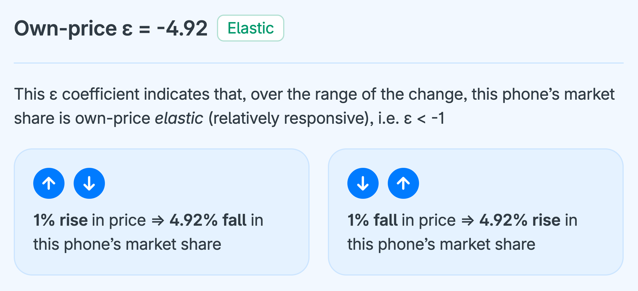
Cross-price elasticity of demand
Cross-price elasticity of demand for an alternative is measured by calculating its cross-price elasticity of demand coefficient (ε), which is simply the ratio of the percentage change in the alternative’s market share to the percentage change in another alternative’s price.
For example, cross-price ε for alternative B of a change in alternative A’s price is calculated using this formula:
and analogously for the effects of a change in alternative A’s price on the market shares of other alternatives (C, D, E, etc) — i.e. to get cross-price ε for C, D, E, etc of a change in alternative A’s price.
Whereas own-price ε coefficients are always negative (discussed above), cross-price ε coefficients are always non-negative in 1000minds’ market simulator. If alternative A’s price increases, and so its market share falls, then alternative B’s share must rise because the alternatives are substitutes, or stay the same because they are unrelated (not substitutes); and vice-versa.
As for own-price ε coefficients, the relative magnitudes of cross-price ε coefficients indicate that alternative B is one of these possibilities:
- cross-price elastic (ε > 1)
- cross-price inelastic (0 < ε ≤ 1)
- cross-price unit elastic (ε = 1)
- cross-price unrelated to alternative A (ε = 0)
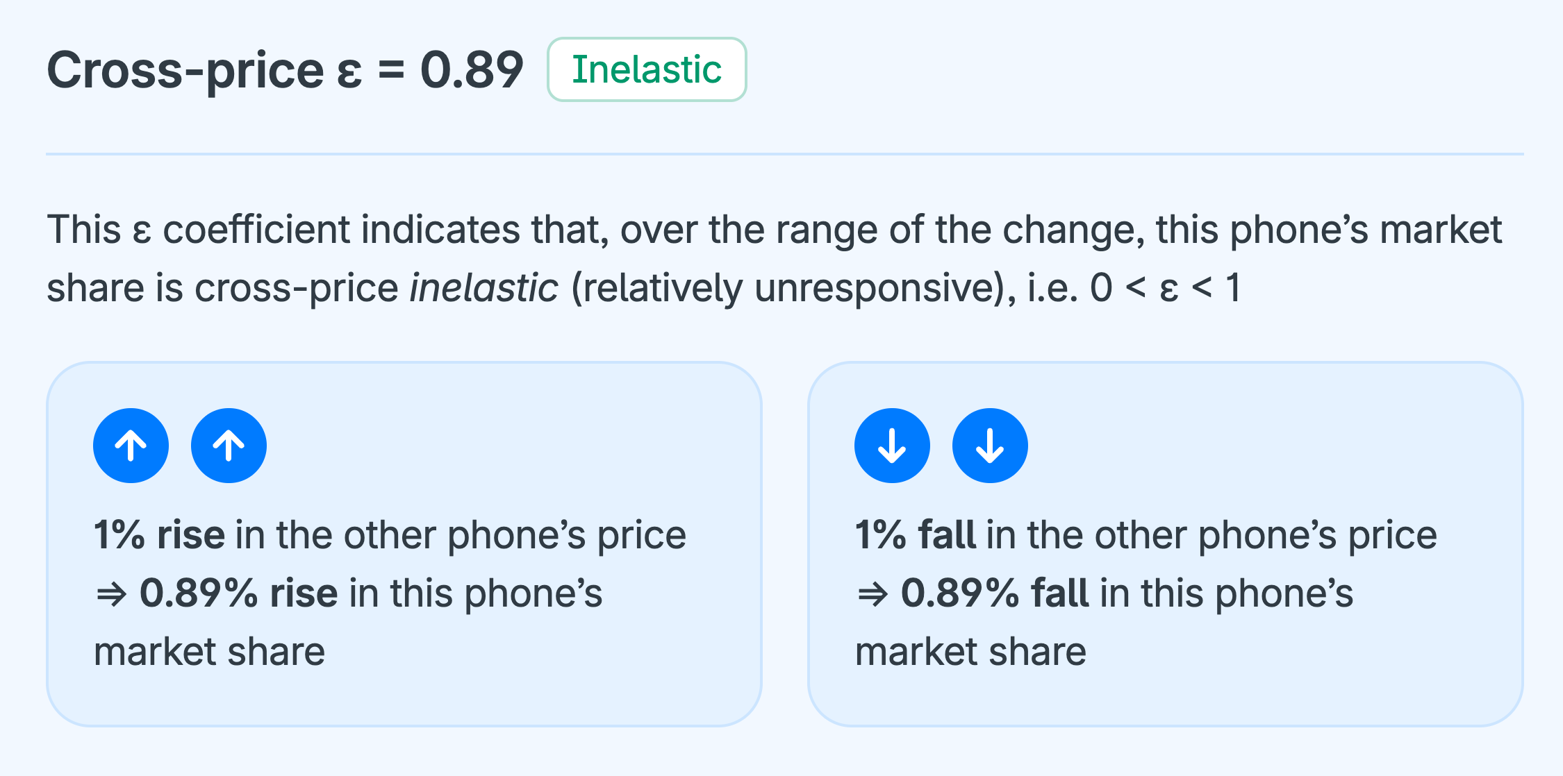
Demand curves
A demand curve is a simple graph showing the relationship between a product’s price and its market share, or share of preferences, at various prices.
Demand curves always slope downward from left to right – i.e. as price decreases, market share increases, and vice versa – because when the price of something goes up, people demand less of it. The universality of this relationship is referred to in Economics as “the iron law of demand”.
Equivalently, the own-price elasticity of demand is always negative.

Marginal willingness-to-pay (MWTP)
MWTP – often shortened to WTP (willingness to pay) – is a measure of how much people would be willing to pay for an improvement in a particular attribute of a product.
For example, how much would people be WTP for a “very good” camera on their phone relative to just an “ok” camera?
The “marginal” in “marginal willingness to pay” is to remind us that the MWTP is for the change to the attribute of interest relative to the alternative’s baseline configuration, i.e. the WTP for just this (marginal) change to the attribute. As returned to later, it is usually inappropriate to add up WTPs across attributes.
Estimating WTP
A common method for estimating WTP is to calculate from the utilities attached to a monetary attribute, such as price, the number of currency units (e.g. dollars or euros) that each utility unit – often referred to as a “util” – is worth. (This conversion exercise obviously requires that a monetary attribute like price was included in the conjoint survey.)
Then, knowing how many currency units each util is worth, it’s easy to convert all the non-monetary attributes, which are valued in utils (utilities), into monetary equivalents. These monetary equivalents are interpreted as WTP.
For example, based on the mean utilities in Table 14, a $400 fall in price from $1000 to $600 corresponds to a utility gain of 21.2 – 0.0 = 21.2 utils. Therefore, 1 util is worth $400 / 21.2 = $18.85.
Applying this “price” of $18.85 per util allows the mean utilities associated with the non-monetary attributes to be converted into WTPs.
For example, as reported in the table, consumers (on average) would be willing to pay $290.57 for an improvement in camera quality from the “ok” baseline to “good”, and $535.85 from the “ok” baseline to “very good”, and so on.
This first WTP estimate of $290.57 can be interpreted as: “The average consumer values an improvement in camera quality from ‘ok’ to ‘good’ as much as they value a $290.57 price decrease.”
In other words, the increase in total utility associated with such a camera upgrade is the same as if price were reduced by $290.57 instead.
It is important to acknowledge that notwithstanding their apparent precision, WTP estimates are indicative rather than exact valuations. Their relative magnitudes are useful for thinking about which features to prioritize for improvement, e.g. if you are a phone designer.
Notice, that the utilities for the price attribute in this example do not increase linearly as price falls. If a different range of prices than above ($1000 to $600) were used, the price-per-util estimate would be different, e.g. between $800 and $600, the price per util is ($800 − $600) / (21.2 − 11.2) = $20, and so on for other price ranges. The earlier estimate of $18.85, from the full price range, can be treated as the average price per util.
| Attributes / levels | Utility (mean) | MWTP | |
|---|---|---|---|
| Camera quality | |||
| ok | 0% | ||
| good | 15.4% | $290.57 | |
| very good | 28.4% | $535.85 | |
| Size | |||
| small (5″) | 0% | ||
| medium (5.5″) | 8.3% | $156.60 | |
| large (6″) | 15.3% | $288.68 | |
| very large (6.5″) | 21.5% | $405.66 | |
| Price | |||
| $1,000 | 0% | ||
| $900 | 3.9% | ||
| $800 | 11.2% | $18.85 | per “util”, i.e. per 1% point |
| $700 | 15.9% | ||
| $600 | 21.2% | ||
| Screen quality | |||
| ok | 0% | ||
| good | 8.5% | $160.38 | |
| very good | 11.2% | $211.32 | |
| Operating performance | |||
| ok | 0% | ||
| good | 3.1% | $58.49 | |
| very good | 9.6% | $181.13 | |
| Battery life | |||
| ok (10 hours) | 0% | ||
| good (11–12 hours) | 2.2% | $41.51 | |
| very good (13+ hours) | 8.0% | $150.94 | |
Download the free workbook if you want to run your own WTP calculations for this example or adapt it for your own application.
Summing WTP across attributes
As hinted at by the inclusion of “marginal” in “marginal willingness to pay” (MWTP), it is safest to focus on changes to a single attribute while all other attributes are held constant – i.e. change one attribute at a time. It’s usually inappropriate to add MWTPs across the attributes and interpret the sum as the willingness to pay for the (upgraded) product as a whole.
For example, from Table 14, it would be a mistake to conclude that upgrading all the phone’s features from “ok” (baseline) to “very good/large” is worth:
$535.85 + $405.66 + $211.32 + $181.13 + $150.94 = $1484.90.
This total ($1484.90) is likely to overstate how much consumers would actually be willing to pay for a phone with all features upgraded. Upgrading several features together implies a correspondingly large price increase that consumers would be willing to pay; however, the relationship between price and utility is likely to be non-linear over large price changes. Adding MWTPs assumes that the same price-utility relationship holds even for large, multi-feature upgrades, which is an assumption that goes beyond what the model can credibly support.
However, the key issue is the size of the implied utility change rather than the number of attributes being changed.
Therefore, we can have more confidence in modeling a scenario where raising the product’s performance on one attribute (e.g. better camera quality) is offset by lowering its performance on another (e.g. worse battery life), than in scenarios where multiple attributes are changed in the same direction (e.g. better camera quality and battery life): the utility change is small in the first scenario and large in the second.
In conclusion, although the principle that a product’s utility is built up from its individual features is fundamental to conjoint analysis, MWTPs are best used to value small changes in utility.
Cluster analysis (market segmentation)
A particular strength of 1000minds is that its PAPRIKA method generates utilities for each individual participant independently of all others in the sample. Each participant’s utilities are derived solely from their own pairwise trade-off judgments and therefore stand on their own, independently of other participants and unaffected by the size or composition of the sample.
In contrast, other conjoint analysis and DCE methods that use hierarchical Bayes estimation derive individual-level utilities by partially pooling information across participants, so each individual’s utilities are influenced by the preferences of others in the sample.
Because PAPRIKA produces independent utilities at the individual level, the resulting data is well-suited to standard cluster analysis techniques (e.g. Everitt, Landau, Leese & Stahl 2011), using Excel or statistics packages such as R, SPSS, Stata, MATLAB.
Cluster analysis is a statistical and machine learning technique used to group a set of objects – in the present context, conjoint analysis participants – into clusters, or market segments, such that members of the same cluster are more similar to each other with respect to their preferences, as captured by their utilities, than to members of other clusters.
Cluster analysis is often called “unsupervised learning” because the algorithm identifies patterns and structure in data without predefined labels or categories. In the present context, the conjoint analysis utilities data gets to speak for itself!
Subsequent explorations – e.g. multinomial logit regression analysis – can investigate if participants’ socio-demographic and background characteristics are associated with their likelihood of belonging to a particular cluster or market segment. Such information is useful for marketing campaigns, for example.
Several methods for performing cluster analysis are available, of which k-means clustering, hierarchical clustering and latent class segmentation are most commonly used in conjoint analysis.
These last two methods are generally considered to be theoretically superior. Nonetheless, k-means is widely used because it is relatively easy to implement and interpret. Therefore, in the context of this non-technical overview, it is the easiest of the three methods to use as a gentle illustration of cluster analysis, as follows.
K-means clustering
Suppose, for simplicity, that there are just two smartphone attributes: e.g. camera quality and phone size. With reference to the schematic in Figure 10, these two attributes are represented by the x and y axes in the four panels, where each (x,y) co-ordinate, denoted with a square, corresponds to a survey participant’s utilities for the x and y attributes.
Thus, 12 participants and their two (x,y) utilities for two attributes are represented in Figure 10.
- The k-means clustering algorithm starts by asking the analyst to specify the number of clusters to be applied – referred to as “k-means”, where k is the number of clusters. In the schematic, there are three clusters: k = 3.
- For each of the three yet-to-be-discovered clusters, a starting point for their two (x,y) mean utilities is randomly chosen by the clustering algorithm: the three colored circles in Panel A.
- Next, all the individuals are clustered by the algorithm to whichever of the three pairs of mean utilities they are closest to (Panel B).
- The clustering algorithm then calculates a new representative center – mean values for the two (x,y) utilities – for each of the nascent clusters (Panel C).
- The process repeats, with all individuals clustered to whichever of the two (x,y) mean utilities they are closest to. This process keeps repeating until no further changes are possible and the clusters have been identified (Panel D).
The usual next step is to test the extent to which each cluster’s members are associated with their observable socio-demographic characteristics, such as age, gender, etc or other consumer behaviors, to identify targetable market segments.

Why use 1000minds for conjoint analysis?
1000minds is a globally recognized, award-winning software solution for conjoint analysis and decision-making. Trusted by governments, researchers, universities and organizations in over 100 countries, 1000minds combines scientific validity with user-friendliness.
At the core of 1000minds is its PAPRIKA method – a patented and award-winning algorithm for adaptive choice-based conjoint analysis and multi-criteria decision analysis (MCDA). PAPRIKA asks simple pairwise-comparison questions and adapts as people answer them, minimizing cognitive effort and ensuring high-quality, reliable results.
What sets 1000minds apart?
1000minds has the following advantages relative to other conjoint analysis & DCE software.
Quick-and-easy setup
Create conjoint surveys in minutes. Easily define your attributes, customize your survey (available in any language and with images) and distribute it to potentially 1000s of participants. Need help getting started? 1000minds’ AI Assistant can help suggest attributes – and alternatives too, if desired – to get you up and running quickly.
User-friendly for all
The intuitive interface and conversational question style make 1000minds easy for both administrators and participants. This user-friendliness ensures better engagement and higher quality data and completion rates than other methods.
Automatic results and reporting
As responses come in, conjoint analysis outputs are produced instantly in real-time – no manual analysis is required. The platform generates clear, actionable results that are easy to interpret and share with stakeholders.
Scientific validity
1000minds is used at over 870 universities and research organizations around the world and regularly cited in peer-reviewed studies (see our 420+ peer-reviewed publications). Its validity and reliability are widely recognized by both conjoint analysis academics and practitioners alike.
Award-winning innovation
1000minds has been recognized in 18 innovation awards, including the Consensus Software Award (sponsored by IBM and Microsoft) which praised 1000minds for “blending an innovative algorithm with a simple user interface to produce a tool of great power and sheer elegance.”
| 1000minds advantage | What it means | Why it matters |
|---|---|---|
| Adaptive | Conjoint survey choice sets adapt to each participant’s answers | Personalized and efficient (no “design” issues) |
| Multi-criteria decision analysis (MCDA) | In addition to conjoint analysis & DCE, 1000minds is for MCDA | Ideal for decision-making (as well as market research) |
| PAPRIKA method | Pairwise comparisons in a simple, adaptive format | Low responder burden and high-quality data |
| Easy conjoint survey setup | Intuitive survey builder with customizable design | Launch studies quickly in any language or format |
| AI assistance | For suggesting attributes and alternatives | Get started quickly, and refine as you go |
| Ready-to-go models | Large library of pre-built examples available | Use as templates if desired, easy to adapt and share |
| Automated real-time analysis | Built-in reporting and export tools | No need for manual data or statistical analysis |
| High engagement | Simple, conversational question style | Higher response rates and more reliable results |
| Scientific validity | Used at 870+ universities and research organizations | Trusted for academic, policy and business uses |
| Award-winning innovation | Recognized by 18 software and innovation awards | Proven technology with real-world impact |
| Free to try | 15 days’ free trial, expert support available | Experience 1000minds now – risk-free! |
Try 1000minds today
Explore how 1000minds can support your work by creating a free account or book a demo with one of our experts to learn more.
Figures
Tables
References
-
K Chrzan (2010), “Using partial profile choice experiments to handle large numbers of attributes”, International Journal of Market Research 52, 827-40
-
M Drummond, M Sculpher, G Torrance, B O’Brien & G Stoddart (2015), Methods for the Economic Evaluation of Health Care Programmes, Oxford University Press
-
B Everitt, S Landau, M Leese & D Stahl (2011), Cluster Analysis, 5th edition, Wiley
-
G Fischer, Z Carmon, D Ariely & G Zauberman (1998), “Goal-based construction of preferences: task goals and the prominence effect”, Management Science 45, 1057-75
-
P Green, A Krieger & Y Wind (2001), “Thirty years of conjoint analysis: Reflections and prospects”, Interfaces 31(suppl 3), S56-S73
-
P Green & V Rao (1971), “Conjoint measurement – for quantifying judgmental data”, Journal of Marketing Research 8, 355-63
-
P Green & V Srinivasan (1978), “Conjoint analysis in consumer research: Issues and outlooks“, Journal of Consumer Research 5, 103-23
-
P Green & V Srinivasan (1990), “Conjoint analysis in marketing: New developments with implications for research and practice“, Journal of Marketing 54, 3-19
-
P Hansen & F Ombler (2008), “A new method for scoring multi-attribute value models using pairwise rankings of alternatives”, Journal of Multi-Criteria Decision Analysis 15, 87-107
-
D Hensher, J Rose & W Greene (2005), “The implications on willingness to pay of respondents ignoring specific attributes”, Transportation 32, 203-22
-
R Johnson (1976), “Trade-off analysis of consumer values”, Journal of Marketing Research 13, 121-27
-
J Louviere, D Hensher & J Swait (2000), Stated Choice Methods: Analysis and Application, Cambridge University Press
-
J Louviere, T Flynn & A Marley (2015), Best-Worst Scaling: Theory, Methods and Applications, Cambridge University Press
-
R Luce & J Tukey (1964), “Simultaneous conjoint measurement: A new type of fundamental measurement”, Journal of Mathematical Psychology 1, 1-27
-
D McFadden (1974), “Conditional logit analysis of qualitative choice behavior”, Chapter 4 in: P Zarembka (editor), Frontiers in Econometrics, Academic Press
-
A Marley & J Louviere (2005), “Some probabilistic models of best, worst, and best-worst choices”, Journal of Mathematical Psychology 49, 464-80
-
J Meyerhoff & M Oehlmann (2023), “The performance of full versus partial profile choice set designs in environmental valuation”, Ecological Economics 204, 107665
-
B Orme (2007), Getting started with conjoint analysis: Strategies for product design and pricing research, 2nd edition, Research Publishers LLC
-
L Thurstone (1927), “A law of comparative judgment”, Psychological Review 34, 273-86
-
K Train (2009), Discrete Choice Methods with Simulation, Cambridge University Press
-
A Tversky, S Sattath & P Slovic (1988), “Contingent weighting in judgment and choice”, Psychological Review 95, 371-84